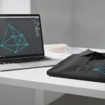
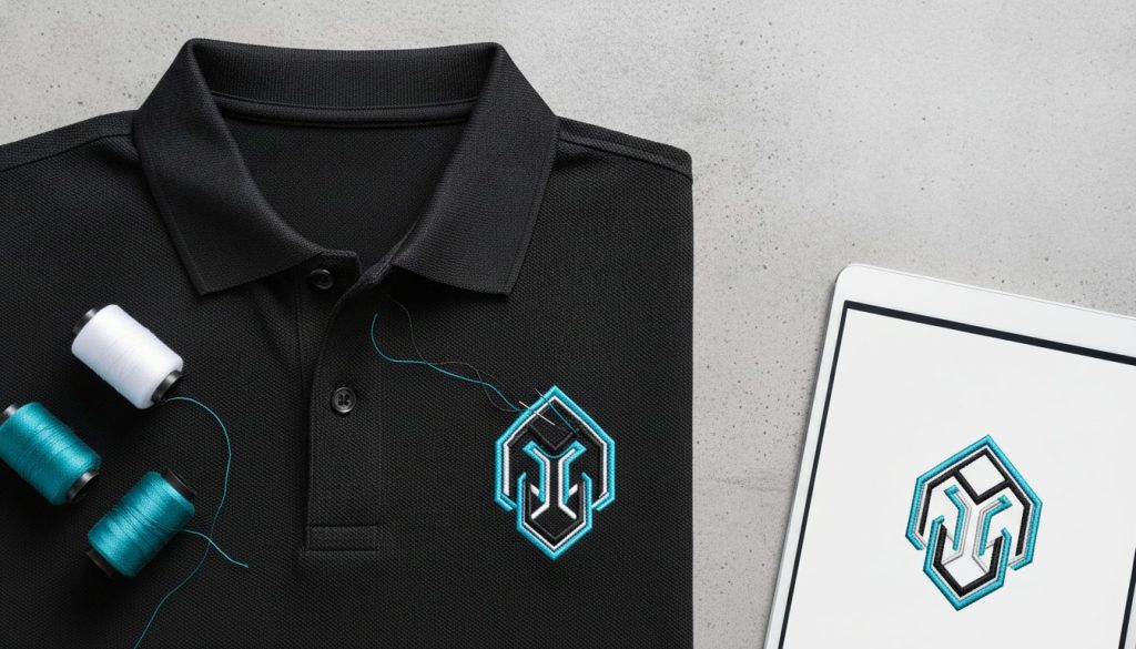
Why does a logo that looks flawless on your laptop screen often turn into a muddy, illegible smudge once it’s stitched onto a polo? It’s a common frustration for brand managers who feel overwhelmed by massive thread catalogs and the fear of a failed bulk order. Finding the best color combinations for embroidered logos isn’t just about matching a palette; it’s a strategic calculation of contrast, texture, and physical visibility. You shouldn’t have to guess how your digital identity will translate to a physical garment.
We believe your corporate identity is a statement of quality, not a design gamble. You need your embroidered Nike polos and custom gear to maintain professional clarity while embracing a modern, vibrant style. We’ve developed this guide to help you master the art of thread-and-fabric pairing, giving you the confidence that every bulk order will look sharp and consistent. It’s time to move past the uncertainty and start creating apparel that commands attention.
We’ll explore the strategic use of high-contrast ratios and the latest 2026 trends, including the serene “Cloud Dancer” white and the sophisticated “Transformative Teal.” You’ll gain a clear framework for choosing palettes that pop, alongside inspiration for sustainable, eco-friendly thread options. Let’s build a visual identity that carries your brand message with absolute precision.
Digital pixels glow; thread reflects. This fundamental difference is why your brand’s digital palette needs a strategic translation before it hits the embroidery machine. When we discuss the best color combinations for embroidered logos, we aren’t just matching hex codes. We’re calculating how physical light interacts with polyester or rayon fibers. Unlike a flat RGB screen, a satin stitch has physical dimension. It catches light from multiple angles, which can shift a color’s perceived hue by 10% to 15%. This “Vibrancy Gap” means that a deep charcoal on your monitor might look like a flat black in thread, or a bright gold might suddenly appear neon under office lights.
To manage this complexity, we apply the 60-30-10 rule. This principle, borrowed from interior design, suggests using a dominant color for 60% of the logo, a secondary color for 30%, and a sharp accent for the final 10%. It prevents the “muddy” look that often ruins multi-color embroidery. By grounding your design in a solid foundation of Color Theory, we ensure every stitch serves a purpose. We don’t just guess; we engineer visibility.
Choosing a scheme depends on the emotion you want to trigger. Monochromatic pairings use various shades and tints of a single brand color. It’s the hallmark of “quiet luxury” and works beautifully for a sophisticated, tonal look on premium apparel. Complementary schemes, such as Navy and Orange or Forest Green and Gold, offer maximum visual vibration. They’re timeless because they provide the high contrast needed for high-visibility branding. If you’re a wellness or eco-focused brand, analogous colors, those sitting next to each other on the wheel, create a harmonious, organic feel that resonates with nature-conscious audiences.
Understanding the difference between Hue, Saturation, and Value is vital for your next bulk order. While Hue is the color itself, Value (the lightness or darkness) is actually the most critical factor for legibility. If your logo’s colors have similar values, they’ll bleed together when stitched. We bridge this gap through precise PMS matching, selecting thread codes that mirror your Pantone standards while accounting for the specific sheen of polyester threads. Remember, stitch density also plays a role. Thin, delicate fonts require the best color combinations for embroidered logos with extreme contrast to fight the “sink” of the fabric and remain readable from a distance.
Your logo doesn’t exist in a vacuum. It lives on fabric. A design that shines on a white t-shirt might vanish on a black hoodie; this is the “Canvas Factor.” It’s the most overlooked element in corporate branding. When selecting the best color combinations for embroidered logos, you must consider how the base fabric absorbs or reflects the thread’s color. For instance, dark fabrics often “bleed” through low-density, light-colored stitches. This makes your logo look thin or cheap. High-quality embroidery requires enough density to block the garment color from peeking through.
Want to ensure your logo stands out? Use the “Pop Test.” Take a photo of your thread samples against the garment and apply a grayscale filter. If the logo disappears into the background in black and white, it lacks the “Value” contrast needed for long-distance recognition. This simple trick saves brands from the frustration of illegible bulk orders. It’s a professional secret we use to guarantee clarity before the first needle drops.
Navy, Black, and Heather Grey are the workhorses of corporate apparel. For navy garments, silver or sky blue often provides a more sophisticated, executive feel than stark white. On black canvases, we see a shift toward high-tech neons and iridescent metallics, mirroring the 2026 Runway Color Forecast. Heathered fabrics present a unique challenge. Their speckled texture creates visual noise that can “eat” mid-tone threads. To combat this, choose bold, highly saturated colors like Royal Blue or Burgundy to pierce through the texture of the tri-blend.
Sometimes, your brand guidelines are non-negotiable, even if they clash with the garment color. If your logo is charcoal and your hoodie is black, we use the “Border Technique.” By adding a thin, high-contrast outline stitch in a lighter shade, we create a visual buffer that makes the logo readable. We also use “Glow” stitches to lift low-contrast elements off the fabric. If the logo is simply too complex for thread, it might be time to consider custom screen printed t-shirts to preserve color fidelity. If you’re struggling to find the right balance, our team can help you select the best color combinations for embroidered logos that respect your brand’s integrity.
Colors carry weight. They influence how a client perceives your expertise before you even speak. Choosing the best color combinations for embroidered logos isn’t just a design choice; it’s a strategic move to build brand equity. When you understand the psychology of color in marketing, your apparel stops being a simple uniform and becomes a tool for persuasion. We don’t just stitch logos; we build icons that represent your company’s core values.
For financial and legal firms, the “Authority” palette is the gold standard. Navy blue, silver, and slate grey communicate stability, trust, and tradition. These colors don’t scream for attention; they command it through understated confidence. Conversely, tech brands often lean into the “Innovation” palette. By pairing electric blue with charcoal or deep black, they signal a forward-thinking, high-energy culture. Consistency is the secret sauce here. When these colors are mirrored across your custom employee onboarding kits, it creates an immediate sense of belonging and cultural alignment for new hires.
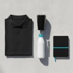
High-quality embroidery acts as a status symbol. It feels permanent and premium compared to a standard print. However, you must consider the “Wearability” factor. Will your team actually wear a neon-pink logo in public? If the colors are too jarring, your investment stays in the back of their closet. By linking your logo colors to cool promotional items like YETI tumblers or Moleskine notebooks, you create a unified brand experience that people are proud to showcase. We help you find that sweet spot where brand guidelines meet modern fashion.
Whether you’re aiming for the serene clarity of “Cloud Dancer” white or the sophisticated depth of “Transformative Teal,” your palette should tell a story. We work with you to ensure that every thread choice reinforces your brand’s unique narrative. It’s about more than just looking good; it’s about being recognized for exactly who you are.
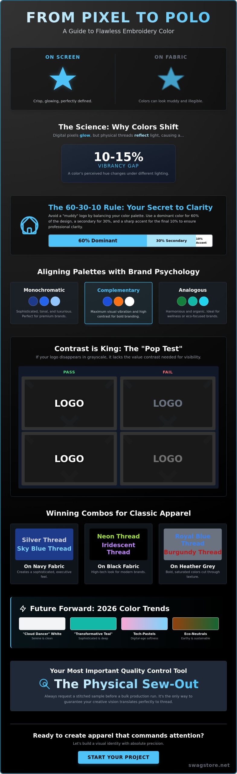
Trends are shifting fast. While classic corporate colors remain reliable, 2026 is ushering in a balance between high-tech vibrancy and grounded serenity. Tech-forward companies are moving away from traditional primary blues, opting instead for ‘Digital Lavender’ and ‘Cyber Lime’ as accent threads. These are currently the best color combinations for embroidered logos when you want to signal agility and modern growth. These colors pop beautifully against dark charcoal or navy canvases, creating a visual energy that feels both futuristic and approachable.
On the other end of the spectrum, we see a massive surge in Eco-Neutrals. Earthy foundations like Sand, Sage, and Terracotta are dominating the monogrammed gifts market. This reflects a broader cultural desire for simplicity and a connection to nature. We’ve also seen a revival in metallics, but with a twist. Traditional, shiny gold is being replaced by Matte Copper and Gunmetal thread. These offer a more industrial, high-end feel that works exceptionally well for executive gifts and premium outerwear.
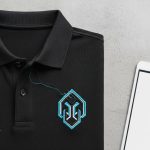
For those seeking ultimate sophistication, the “Stealth” look is gaining traction. This involves dark-on-dark embroidery, such as matte black thread on a black Nike polo. It’s subtle, professional, and speaks to a brand that doesn’t need to shout to be noticed. It’s a favorite for high-end corporate retreats and leadership kits.
Pantone 11-4201, named “Cloud Dancer,” is the 2026 Color of the Year. This serene, lofty white is the first of its kind to hold the title, symbolizing clarity and spaciousness. We’re seeing it integrated into trade show apparel as a crisp, clean base that allows accent threads to shine. Integrating “Cloud Dancer” into your logo doesn’t mean changing your brand; it means using it as a high-contrast border or a secondary fill to modernize your look. It pairs perfectly with the performance fabrics of Nike and Under Armour, ensuring your team looks fresh under any light.
Sustainability isn’t just a buzzword; it’s a visual language. We’re increasingly matching organic cotton fabrics with muted, natural thread tones. The “Unbleached” look, featuring raw, off-white threads, has become a hallmark of environmental responsibility. Using these earthy palettes for your trade show giveaways signals a commitment to the planet that resonates with modern consumers. Recycled embroidery yarn is now an industry standard, allowing you to maintain high-quality aesthetics while reducing your footprint.
Ready to upgrade your corporate wardrobe with the latest 2026 trends? Explore our collection of custom embroidered apparel to find the perfect match for your brand.
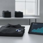
Pixels are predictable; thread is tactile. Choosing the best color combinations for embroidered logos is only the first half of the battle. The true challenge lies in the transition from a glowing monitor to a high-speed embroidery machine. A digital mockup is a helpful guide, but it’s ultimately a simulation of light. A physical sew-out is reality. It shows exactly how the thread interacts with the specific weave of your chosen Nike or Under Armour polo. We believe this final step is where brand equity is either solidified or lost.
Thread type is your next critical decision. Most corporate orders rely on Polyester. It’s incredibly durable; it resists bleaching and maintains its color through industrial laundering. It has a subtle, professional sheen that withstands heavy use. Rayon, while softer and more vibrant, is more delicate. It’s often reserved for high-fashion pieces where color depth is the priority over daily wear and tear. We help you navigate these technical choices to ensure your vision survives the production floor without losing its luster.
Stitch density also alters your perception of color. A dense fill stitch packs threads tightly together, making the color appear richer and sometimes slightly darker than the spool itself. A light fill allows the garment’s texture to break up the color, which can make the logo look more muted or “thin.” It’s a delicate balance. If the density is too high, you risk puckering the fabric; if it’s too low, you lose the “pop” we’ve worked so hard to design. We manage these variables to guarantee that the best color combinations for embroidered logos translate perfectly to every garment.
We recommend a physical sample for any order exceeding 100 units. It’s your insurance policy against surprises. When you receive a sew-out, look beyond just the colors. Check for thread breaks or consistency in the satin stitching. Ensure the edges are crisp and the fabric isn’t pulling or distorting. If the color balance feels off, this is the moment to provide feedback. Our artists can adjust the stitch direction or density to better reflect your brand’s unique energy and ensure a flawless finish.
We take a curated, expert approach to promotional items and corporate apparel. You aren’t just getting a vendor; you’re gaining a creative consultant who understands the nuances of physical branding. With access to premium thread catalogs featuring over 400 vibrant color options, we can match even the most complex brand guidelines with precision. We ensure that your logo looks as consistent on the first unit as it does on the thousandth, providing national brands with the reliability they demand.
Ready to see your logo in its best light? Get a custom quote for your bulk order today.
Your logo is more than a digital file; it’s a tactile representation of your company’s commitment to quality. We’ve explored how high-contrast ratios and the “Canvas Factor” dictate visibility, and how emerging 2026 trends like “Cloud Dancer” white can modernize even the most traditional palettes. By mastering the best color combinations for embroidered logos, you move from simple decoration to strategic brand building. It’s about ensuring your identity remains clear, professional, and impactful across every garment in your fleet.
We specialize in bringing these complex visions to life. Whether you’re ordering bulk Nike and Under Armour polos or designing premium employee onboarding kits, our expert Pantone-to-thread matching services guarantee absolute consistency. We’re trusted by national brands to handle the technical heavy lifting, from initial sew-outs to final production. Don’t settle for “close enough” when you can achieve perfection through professional precision and creative expertise.
Design Your High-Impact Branded Apparel Now and let’s create something that your team will be proud to wear for years to come. Your brand deserves to stand out with absolute clarity and modern style.
Navy and Silver, Forest Green and Gold, or Charcoal and Electric Blue are the most reliable professional pairings. These combinations provide a balance of authority and modern style that works across various corporate environments. We often recommend these for executive apparel because they maintain high visibility without feeling overwhelming. They’re the go-to choices for leaders who want to signal stability and innovation simultaneously through their branded gear.
We handle gradients by using a technique called color blending or step fills. Instead of a smooth digital fade, we layer different thread shades to create a textured transition that mimics the original design. It’s important to simplify the gradient into three or four distinct thread colors to ensure the logo doesn’t look cluttered. This maintains the essence of your brand while respecting the physical limits of embroidery thread.
Yes, your logo may look slightly different due to the specific fabric weave and sheen of each brand. Nike’s Dri-FIT often has a different texture than Under Armour’s performance fabrics, which can affect how the thread sits on the surface. We adjust stitch density for each garment type to ensure the best color combinations for embroidered logos remain consistent and professional regardless of the brand you choose for your team.
We use specialized software to match your brand’s exact PMS colors to the closest available thread shades from premium catalogs. While thread is a physical medium, we can usually achieve a match that is visually indistinguishable from your digital brand guidelines. For bulk orders, we always suggest a physical sew-out to confirm the color accuracy before starting full production. This ensures your global brand identity stays intact across all platforms.
White, Silver, and Gold are the most reliable choices for black shirts, but vibrant neons like “Cyber Lime” are trending for 2026. These high-contrast options ensure your logo is readable from a distance and pops against the dark background. If you want something more subtle, a charcoal thread creates a premium stealth look that is popular for executive gifts. Always prioritize high-value contrast to ensure your brand remains the focal point.
Metallic thread is excellent for small accents but should be used sparingly to avoid making the logo look busy. It adds a touch of luxury to corporate gifts or anniversary apparel that standard polyester can’t match. However, metallic threads can be slightly more abrasive on the skin, so we suggest keeping them to small design elements rather than large fill areas. It’s a great way to make a standard logo feel like a premium status symbol.
You can technically include up to 15 colors, but we recommend sticking to three or four for maximum impact. Too many colors can make an embroidered logo look cluttered and reduce the clarity of fine text or intricate details. By focusing on a primary, secondary, and accent color, you ensure the best color combinations for embroidered logos stand out with professional clarity and modern style that people actually want to wear.
Distortion usually happens because of push and pull factors where the thread tension pulls the fabric inward during the stitching process. Certain colors or high-density stitch types can exacerbate this on stretchy performance fabrics like those used in Nike polos. We use specialized stabilizers and adjust the digitizing process to compensate for these physical forces. This ensures your logo maintains its intended shape and size regardless of the thread colors used.