
How many corporate t-shirts are currently gathering dust in the back of your employees’ closets? It’s a common frustration for leaders who invest heavily in swag only to see it relegated to the “sleep shirt” pile. We’ve all seen the wasted potential of low-quality items that fail to spark engagement or pride. If you want to stop wasting your marketing budget, you need to understand how to design a company t-shirt people will wear in the real world. It’s not just about slapping a logo on a basic tee. It’s about creating a premium piece of apparel that rivals the best retail brands on the market.
We believe your brand deserves to be seen, and that starts with a “logo-second” philosophy. In this guide, we’ll share the retail-quality secrets that turn standard corporate gifts into high-end apparel your team will actually reach for every morning. We’ll walk you through the technical essentials of vector graphics, the shift toward heavyweight 300 GSM fabrics, and the “Quiet Luxury” trends dominating 2026. Get ready to transform your team uniforms into a powerful, professional statement that boosts your brand visibility naturally and creates a lasting impression.
Most corporate swag ends up in a dark corner of a dresser drawer. We call this the “Pajama Trap.” It happens when a shirt is only comfortable enough to sleep in, but not stylish enough to wear out. If your team only wears your brand behind closed doors, your marketing investment is essentially invisible. You’ve provided a utility for sleep, not a tool for brand advocacy. To break this cycle, you must stop thinking of apparel as a giveaway and start viewing it as a retail product.
Mastering how to design a company t-shirt people will wear requires a deep dive into the psychology of the “Favorite Tee.” People don’t keep shirts because of a large logo. They keep them because the fabric feels like a second skin and the fit is modern. When comfort and fit align, the logo becomes a badge of honor rather than an eyesore. If the shirt makes the wearer look good, they’ll wear it everywhere; from the gym to the office and beyond. It’s about earning a spot in their weekly rotation through superior quality.
Let’s look at the math of brand visibility. A cheap, $5 promotional tee that gets worn once before being tossed has a high cost per impression. Conversely, a $15 retail-quality shirt that someone wears 100 times costs just 15 cents per impression. High-quality apparel isn’t an expense; it’s a high-yield investment in your brand’s real-world presence. In 2026, the trend has shifted decisively away from “disposable swag.” Modern audiences demand sustainable, high-quality staple pieces that serve a purpose in their daily wardrobe. They want gear that lasts years, not months.
Choosing bargain-bin materials sends a message you probably didn’t intend. It tells your clients and employees that your brand is temporary or low-value. Small details like an itchy tag or a collar that loses its shape after one wash lead to immediate disposal. We’ve detailed how these choices affect your long-term image in our guide on The Hidden Cost of Cheap Swag. When the quality is lacking, your brand perception suffers alongside the fabric. It’s better to order fewer units of a premium item than a mountain of shirts no one wants to touch.
A wearable company shirt is one that passes the “grocery store test,” meaning your team members feel confident and stylish enough to wear it during their personal weekend errands. We’re seeing a massive shift toward athleisure and high-performance fabrics in the modern workplace. Employees want pieces that transition seamlessly from a morning meeting to an afternoon run. By meeting this retail standard, you ensure your brand stays in the light. When you prioritize how to design a company t-shirt people will wear, you’re building a community of walking ambassadors who are proud to represent your vision.
Digital design tools are incredibly powerful, but a stunning graphic on a scratchy, boxy shirt is a missed opportunity. Most guides focus on the art, yet the physical garment determines if a piece stays in the closet or hits the streets. Understanding how to design a company t-shirt people will wear starts with the physical canvas. In 2026, we’re seeing a massive shift toward heavier, structured fabrics. While the old standard was a flimsy 150 GSM, premium brands are now moving toward 240-300 GSM combed cotton for that high-end, retail feel.
Fabric weight, or Grams per Square Meter (GSM), dictates how the shirt hangs on the body. A higher GSM provides a structured silhouette that hides undershirts and resists wrinkling. For active corporate cultures, moisture-wicking performance fabrics are the gold standard. These aren’t the shiny, plastic-feeling polyesters of the past. Modern performance blends look like matte cotton but offer the breathability of athletic gear. If you’re planning a large-scale project, choosing the right custom screen printed t-shirts ensures your team feels as good as they look.
The “soft feel” is the number one request from employees. To achieve this, you must look past basic carded open-end cotton, which feels rough and fuzzy. Premium ring-spun cotton is made by continuously thinning and twisting the fibers, resulting in a much softer and more durable strand. Tri-blends, a mix of cotton, polyester, and rayon, offer the best drape and longevity. These fabrics don’t just feel great; they also affect your print quality. Smoother surfaces allow for tighter ink absorption and sharper detail in your screen prints.
The days of the one-size-fits-all “Unisex” boxy tee are over. Professional teams now expect “Retail Fit” apparel that follows the body’s natural lines. Side-seamed construction is essential here. Cheap shirts are often “tubular,” meaning they’re just a fabric cylinder that eventually twists and loses its shape. Side seams ensure the shirt fits properly after dozens of washes. We recommend offering specific men’s and women’s cuts rather than a generic unisex option. It shows you’ve considered everyone’s comfort. Look for details like shoulder-to-shoulder taping, which reinforces the garment’s structure and prevents the neckline from sagging over time. This attention to detail turns a simple giveaway into a professional uniform.
The canvas you choose dictates the ceiling of your design’s success. If you’re struggling with how to design a company t-shirt people will wear, look at the labels in your own closet. Most people gravitate toward brands they already trust for quality and style. Co-branding with industry leaders like Nike or Under Armour provides an instant psychological shortcut to value. When an employee or client sees a familiar “Swoosh” alongside your corporate logo, they don’t see “swag.” They see a high-value piece of performance gear that they’re proud to wear in public.
This shift in perception directly impacts your “keep rate.” Generic promotional tees are often treated as disposable, while premium branded apparel is treated as a gift. Statistics in the apparel industry show that retail-branded items are kept up to three times longer than non-branded alternatives. This longevity is rooted in durability. A brand-name shirt is engineered to survive 50 or more washes without losing its shape, pilling, or fading. When you include these high-end options in your employee onboarding gift kits, you’re making a long-term investment in brand advocacy that pays dividends every time that shirt leaves the house.
The brand you choose should align with your corporate personality. Nike remains the gold standard for lifestyle appeal and “cool” corporate cultures. It’s the perfect choice for creative agencies or startups that want a modern, streetwear-influenced look. Under Armour, on the other hand, is the powerhouse for high-performance and tech-focused teams. Its focus on innovative fabric technology makes it ideal for companies with an active, fast-paced “grind” mentality. To maintain a professional look, ensure your corporate logo is positioned to complement, not compete with, the manufacturer’s branding. A small, clean placement on the sleeve or back neck often works best.
Premium retail brands act as a powerful trust signal that tells the world your company doesn’t cut corners on quality. This level of intentionality is essential when selecting cool promotional items that people actually want to keep and use. By choosing a respected canvas, you’ve already won half the battle of how to design a company t-shirt people will wear. You aren’t just buying fabric; you’re buying a reputation for excellence that mirrors your own business standards.
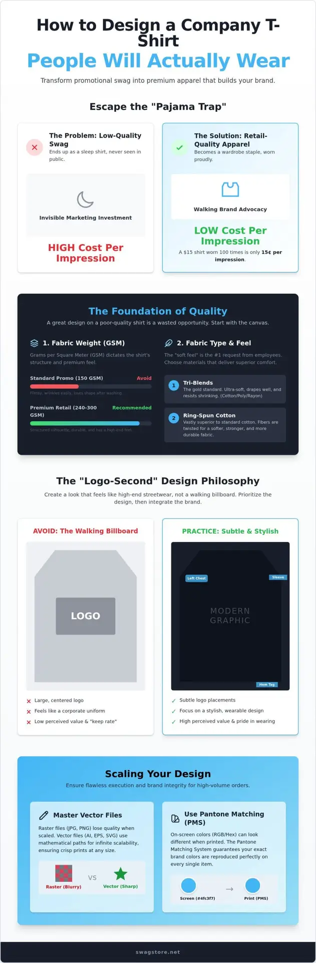
Stop designing billboards. If you want to master how to design a company t-shirt people will wear, you must embrace the “Logo-Second” philosophy. This strategy prioritizes the aesthetic value of the garment over the size of your corporate mark. Ask yourself: if you removed your logo, would your team still want to wear this shirt? In 2026, the most successful corporate apparel looks like it belongs in a high-end boutique, not a trade show bin. It’s about creating a piece of art that happens to be branded, rather than a brand that happens to be on a shirt.
Color theory is your best friend in this process. While your brand guide might feature high-visibility colors, they rarely translate to a wearable daily staple. We suggest sticking to muted, wearable neutrals such as charcoal, navy, or olive. These tones integrate seamlessly into a modern wardrobe, ensuring your apparel doesn’t get relegated to the gym bag. Typography trends for 2026 are leaning heavily into minimalism and vintage-inspired fonts. Clean lines and plenty of white space create a timeless look that feels intentional and sophisticated.
Branding doesn’t always need to be front and center. Moving your logo to alternative locations can instantly elevate the perceived value of the shirt. Consider these retail-inspired placements:
The physical feel of the print is just as important as the fabric itself. Heavy, “plastic-y” prints are a major pain point for wearers. We recommend using water-based inks to achieve a “no-feel” finish. These inks soak into the fibers rather than sitting on top of them, resulting in a shirt that stays breathable and soft. For those seeking a truly sophisticated vibe, tonal printing is a fantastic option. By using a shade of ink that’s only slightly darker than the shirt color, you create a subtle, high-end effect. You can also experiment with distressed graphics to give a brand-new shirt that “vintage favorite” feel from the very first wear. Ready to elevate your brand’s presence? Explore our custom screen printed t-shirts to see how these design secrets come to life.
Scaling a design from a single digital concept to a thousand physical units requires technical precision. Even if you’ve mastered how to design a company t-shirt people will wear, poor file preparation can ruin the final product. Professional screen printing relies on vector files like .AI or .EPS. Unlike raster images such as .JPG or .PNG, which are made of pixels and blur when enlarged, vectors are based on mathematical paths. They stay crisp at any size. This ensures your logo looks sharp whether it’s on a sleeve or a full back print.
Consistency is the next hurdle. Screens and printers interpret colors differently. To ensure your brand identity remains intact across a massive run, we use the Pantone Matching System (PMS). Specifying a PMS code guarantees that your exact brand colors are reproduced faithfully on every single garment. Before the ink hits the fabric, the mockup phase is non-negotiable. Seeing your design on a digital model allows you to verify placement, scale, and color contrast before committing your budget. This is where SwagStore.NET steps in. We streamline the entire process, providing the professional design support needed for complex, high-volume screen printing.
Your art must be ready for the production floor. First, convert all fonts to outlines. This prevents formatting errors if the printer doesn’t have your specific typeface. Next, check your line weights. Lines that are too thin won’t hold ink properly through the screen mesh. Finally, always specify your ink colors using the Pantone system. These steps eliminate guesswork and ensure a retail-quality finish that meets the high standards we’ve discussed throughout this guide.
A successful rollout depends on a smart size breakdown. We generally recommend a bell curve distribution, focusing heavily on Medium, Large, and XL, while still being inclusive of smaller and larger sizes. Keep in mind that premium brands like Nike and Under Armour often have specific lead times due to their high demand. Planning ahead ensures your gear is ready for major corporate milestones. High-end apparel is a game-changer for trade show giveaways, turning a simple booth visit into a long-term brand impression. When you combine technical excellence with strategic distribution, your company apparel becomes a coveted item rather than just another piece of swag.
Creating apparel that survives the annual closet purge requires a fundamental shift in perspective. It’s about moving away from disposable promotional items and embracing retail-quality standards that respect the wearer’s personal style. By prioritizing high-performance fabrics, modern silhouettes, and the “logo-second” philosophy, you transform a simple giveaway into a coveted piece of daily gear. You’ve now seen that the secret to how to design a company t-shirt people will wear lies in the intersection of premium comfort and strategic, subtle branding.
Don’t let your next bulk order end up relegated to the sleepwear pile. As an Authorized Premium Brand Dealer, we specialize in bringing your vision to life on the world’s most trusted canvases. Whether you’re looking for the lifestyle appeal of Nike or the technical edge of Under Armour, we include expert design consultation to ensure your technical files are print-ready and perfect. We offer national shipping on all bulk orders to keep your rollout simple and efficient. Start your premium bulk t-shirt project with SwagStore.NET today and give your team something they’ll reach for every single morning. Your brand deserves to be seen in the real world.
Follow a standard bell curve distribution based on your team’s demographics for the best results. For a typical bulk order, we recommend a ratio of 10% Small, 25% Medium, 30% Large, 25% XL, and 10% 2XL. This ensures you have enough of the most common sizes while remaining inclusive. Always check if your specific brand, like Nike, runs true to size or has a slimmer retail fit before finalizing your counts.
Professional screen printing is the gold standard for high-volume orders because it offers unmatched durability and vibrant color. It’s the most cost-effective solution for bulk projects. Screen printing allows the ink to bond deeply with the fabric, ensuring your design doesn’t crack or peel after a few washes. For premium brands, this method maintains the high-end retail feel that employees expect from their gear.
Yes, you can co-brand with these industry leaders through an authorized provider like SwagStore.NET. Using retail-quality canvases is a major factor in how to design a company t-shirt people will wear long-term. We specialize in adding your corporate logo to these premium garments using professional screen printing or embroidery. This partnership adds instant perceived value to your swag, making it a piece of apparel that people actually want to keep.
Limit your design to one or two colors for the most professional and cost-effective result. Minimalist designs are trending in 2026 because they look more like retail fashion and less like a promotional giveaway. Using fewer colors reduces the setup cost for screen printing and ensures a cleaner, more sophisticated look. A simple, well-placed logo in a single neutral tone often has a much higher “keep rate” than a cluttered graphic.
Screen printing involves pushing ink through a mesh stencil directly into the fabric, while heat transfer applies a pre-printed vinyl layer onto the surface using heat. Screen printing is far superior for bulk orders because it’s more durable and stays breathable. Heat transfers can feel like a heavy sticker on the chest and often crack over time. If you want a “no-feel” finish that lasts, professional screen printing is the only choice.
Use the Pantone Matching System (PMS) to specify your exact brand colors for the printer. When printing on dark shirts, we apply an “underbase” of white ink first to ensure your colors stay vibrant and don’t get absorbed by the fabric color. This technical step is crucial when you’re figuring out how to design a company t-shirt people will wear across a diverse range of garment colors. It ensures total brand consistency.
Always provide your artwork in a vector format, such as .AI, .EPS, or a high-resolution .PDF with all fonts converted to outlines. Vector files are essential for professional screen printing because they can be scaled to any size without losing clarity. Avoid sending raster files like .JPG or .PNG, as these often result in blurry or pixelated edges. Providing the right file type ensures your final print looks sharp and professional.
Small, subtle logos are generally more effective for apparel intended for daily wear. A massive logo can make the wearer feel like a walking billboard, which often leads to the shirt being relegated to the pajama drawer. A clean, left-chest placement or a small logo on the sleeve mimics high-end retail brands. This “logo-second” approach increases the likelihood that your team will wear the shirt in public social settings.